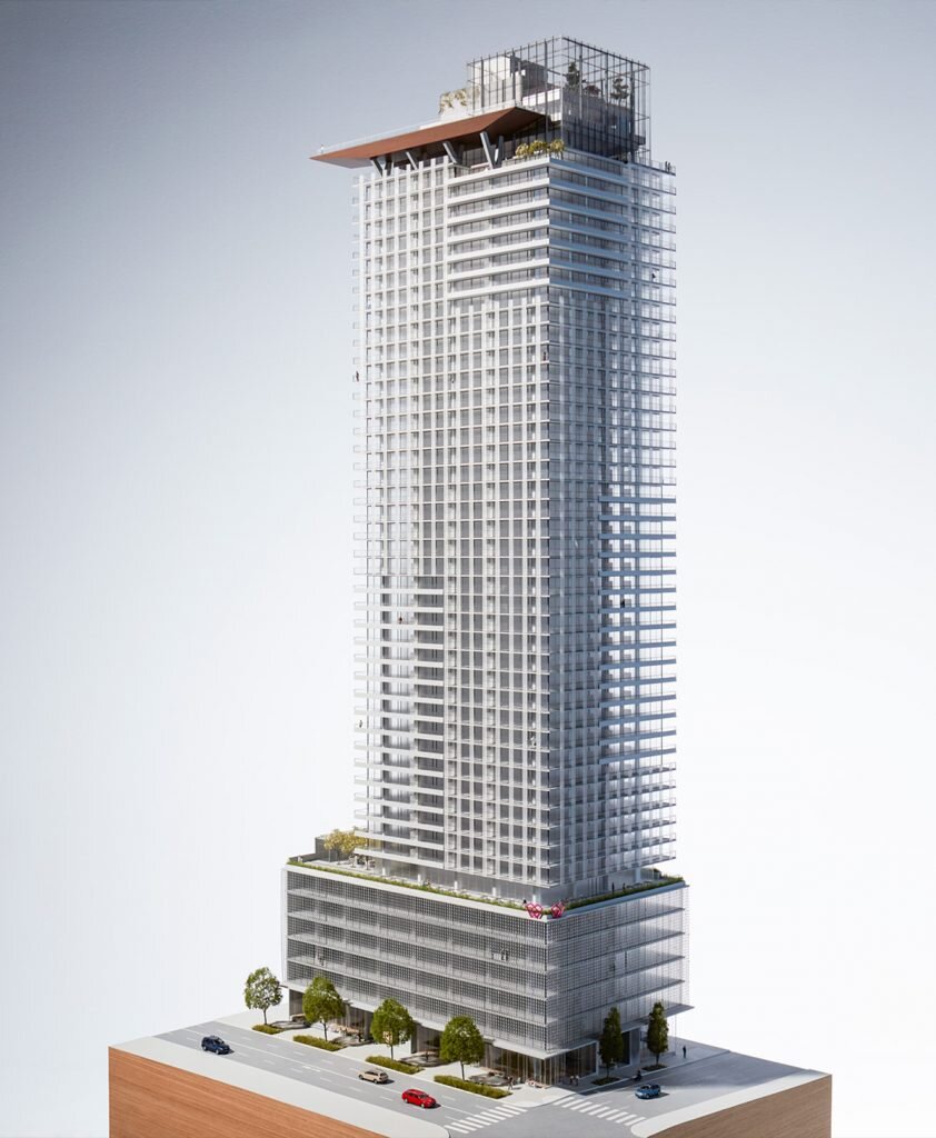
As any painter knows, having the right palette prepared is half the work of art. When Westbank and the interior designers at James KM Cheng architects began the design process for First Light, they started off by asking a series of questions. What is the nature of light here, and which colors are most inspiring under them? How could the textures and details within a new tower build on connections to Seattle’s strong maritime and aviation heritage? How could the finishes and furnishings of the building’s interiors express the sentiment that this is a design for Seattle, and nowhere else?
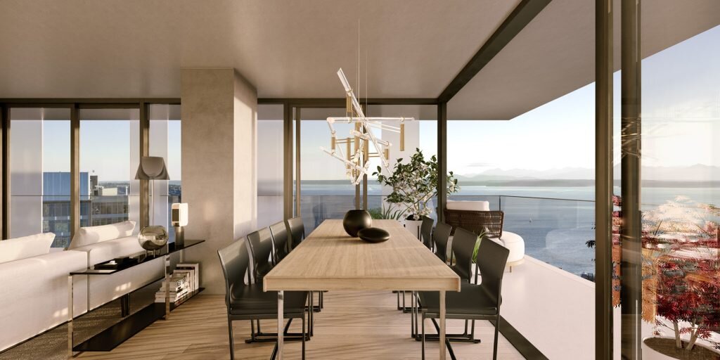
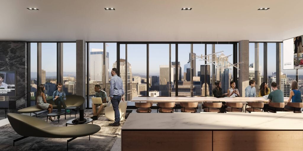
Some of the answers to these questions came together quickly. As a city mainly built in the twentieth century, concrete has long been the construction material of choice for such beloved institutions as the Pike Place Market, high-rise towers, college and university buildings, and the infrastructure of airports and overpasses. The design team decided that concrete building elements should be celebrated, shown with pride in public lobbies, even within private spaces of suites. Moreover, when concrete appears, it should be uncovered and unvarnished – direct and simple. Coupled with the exposed concrete, a rough aggregate warm-toned terrazzo is used as a highlight on some balconies and garden decks, including the lobbies.
Each home at First Light will have a cool, natural palette throughout, supplemented with contrasting design details. Floor-to-ceiling, triple-paned windows will allow residents to enjoy spectacular views, with the mountains of the Olympic Peninsula glinting in the distance.
OCCUPANCY winter of 2020/2021
Details
Studio
One Bedroom Units
Two Bedroom Units
Three Bedroom Units
Penthouse Units


